CRUX OF THE BRIEF
The introductory sentence of the brief says the assignment focuses on “one of the most fundamental principles of design: contrast”. The photographic output requires 16 photographs, grouped into eight pairs and clearly marked with the contrasts they aim to demonstrate. A final photograph is required to demonstrate contrast in the same image.
In addition to the photographic output, the student is asked to reflect on the learning from the assignment and undertake a self-assessment against the list of course assessment criteria shown on page 10 of the OCA course folder.
BACKGROUND THEORY
Johannes Itten
In effect, the brief was written in the 1920s by Johannes Itten who is cited by Freeman as the founder of a theory of composition based on contrasts. Itten is said to have set his students an exercise to help them explore the compositional possibilities of contrasts. The set of contrasts he listed for his students are almost identical to those for this assignment. Through the exercise Itten also wanted his students to make an emotional connection with their work, to “awaken a vital feeling for the subject” (Freeman 2007, p.34).
Photography and psychology are connected
There is an important connection between the field of cognitive psychology and Itten’s exercise on contrasts, and by inference a connection with photography and the goals of this assignment. That connection is through the way we use contrasting ‘labels’ to help us interpret and organise our observations and experiences in life. Personal Construct Theory (Kelly 1955) and the associated technique called Laddering (Hinkle 1965) connects the field of human psychology with the compositional idea of contrasts.
In fact, Personal Construct Theory (PCT) has many implications for photographers. For example, it helps us to understand the psychology associated with the development of a photographer’s voice and style. What we want to say through photography and how we say it, is just a part of our psyche. If ‘our eyes are the windows to our soul’ then the psychologist might say that ’our photographs are the windows to our personal construct system’.
Personal Construct Theory
Constructs are defined by PCT as bipolar, contrasting concepts, ideas and emotional states. These constructs are in effect a ‘labelling’ system our mind uses to make sense of our environment. We learn and develop this system early in life. For example, children are taught at an early age the construct of ‘hot-cold’. This is a relatively simple, descriptive construct but parents will recognise that it also taps into deeper and more complex constructs such as ‘dangerous-safe’ and even deeper into the motivation of parents to protect their children, an essential part of their primary value and belief system.
The particularly important issues here for photographers are that the construct system we use in our everyday life is the same system we use in our photography, and secondly the things we see and choose as subjects may initially be categorised at a superficial level of our construct system (subordinate constructs) but our brain unconsciously links them to constructs that have a deeper emotional significance for us (superordinate constructs). I believe this is the process in place when someone describes a photograph as evocative. Their construct system is being used to awaken within them a deeper feeling (or as Itten would say ‘a vital feeling’) about the subject. Of course the same process occurs from the photographer’s perspective.
Laddering
Laddering is a technique that maps a person’s construct system from subordinate to superordinate constructs. Using a selection of photographs, the approach is outlined in another post in this Learning Log (Identifying the ‘hidden message’ in images using Laddering – 16 September 2012). The photographs used in that post are from the book ‘The Photograph’ (Clarke 1997) and through Laddering the post shows how preferences between photographs can be mapped from a first response to more fundamental constructs.
The idea of simple constructs tapping into deeper psychological beliefs is confirmed by Bourne and Jenkins (2005, p.414) who cite Bannister and Fransella (1986) saying Laddering “can start with any type of construct, be it about kinds of soap, opera, television program or work of art – the end product will be some superordinate construct to do with one’s philosophy of life”. I think Itten also recognised this psychological process hence the exercise to help his students ‘feel’ their composition/subjects. To achieve this “vital feeling” requires more than a simple, literal connection with a descriptive label such as ‘light-dark’, it requires an assimilation of that contrast into a person’s broader and deeper construct system and this occurs by our eyes and mind working together to generate a pathway from what we see to our deeper personal values and philosophy of life.
The same space
In summary, although Personal Construct Theory and the brief for this assignment express themselves in different ways using the perspectives of human psychology and photography; for me they co-exist in the same ideological space. This is particularly true in relation to Itten’s theory of composition based on contrasts and the emotional connection he was wanting his students to make with their subjects, but the theory of personal constructs can be applied more widely to photography. It helps us understand more about the psychological forces that guide us as we strive to create evocative images, respond to the work of other photographers and search to create a distinctive photographic ‘voice’ and style.
FROM THEORY TO PRACTICE
The process
This section of the assignment report outlines the practical steps I took to produce the 17 photographs for submission. The process had three stages, none of them are surprising but in terms of developing my approach to the assignments it helps me to break the process down to its basic level. This helps me to systematically generalise my experience from this assignment which will be helpful in accelerating the completion of future assignments.
The three stages were:
- exploration of potential locations
- simplification of the visual information
- production of the 17 images
Exploration
The final images for the assignment were taken at seven locations in two different countries, two locations in England and five locations in Spain. The exploration phase, within the context of the assignment brief, triggered a new way of looking at potential locations and consequently a new way of thinking about potential opportunities for photographs. I think this has been an important step in my development as a photographer.
My previous experience of searching for and thinking about potential locations for photography has been at a more general level (a landscape, a sunset, a forest, a beach). The brief required me to re-think potential locations at a more detailed level. For example, rather than seeing a location as a forest I had to look at it in terms of the ‘contrasts’ it contained. The forest becoming a location with ‘deciduous and evergreen trees’, ‘sunny and shaded areas’, ‘rough and smooth barks’, ‘young and old trees’; the list is potentially endless.
I found myself grouping locations together in terms of the attributes of a ‘contrast’ they shared rather than their ‘normal label’.The experience was developmentally illuminating and has opened up a new way of thinking about locations for photographic trips. A beach may be different in many ways to a forest but they become linked when considered in relation to the elements of constructs they contain. For example, ‘large rocks and large trees’, ‘rough bark and rough rocks’; or in terms of contrasting attributes, ‘large rocks-small trees’, ‘rough bark-smooth rocks’. I gained a deeper appreciation of the locations and the detail they contained, an insight that is particularly important to me as I find myself developing an affinity for images in the natural world that show a detail of a subject and create an almost abstract feel.
Simplification
This step in the process was about simplifying the enormous amount of visual detail at each location it into a number of potential compositions to match the brief.
An important skill within photography is learning how to distil the complexity of visual information the eye sees and the details our brain ‘fills in’, into the constraining frame of a two-dimensional photograph.
Barnbaum (2010, chapter 2) says that our eyes and brain see differently to the camera. A photograph being unable to capture and present an image with the same detail and vividness as the brain. In order to counteract this the photographer must learn to ‘see’ as the camera does, in essence when thinking about a potential image and the composition, the developing photographer needs to consciously think twice – first with his brain and then as the camera.
The brief for the assignment helped with this because of its cautionary note that the images must show visual contrast rather than relying on the brain to make the necessary interpretations using our normal construct system. The brief says “A lead weight may be heavy but does it look heavy?”. We would all place a lead weight towards the heavy end of the ‘light – heavy’ construct but the camera doesn’t know that, so our composition through “colour, tone, lighting and relationships to the background” has to compensate by simplifying all the compositional possibilities into an image that clearly projects to the prospective viewer the intended message – in this context, a particular pole of a contrast. I am not bold enough to say that all of my final images do this perfectly or even expertly but I have selected the 17 images in this submission because I consider they do simplify the overwhelming detail and possibilities I found in different locations into compositions that convey a visual contrast.
Production
This part of the process was often iterative with the previous two stages, involving reviews of the images and sometimes a return to the location to improve the composition or a search for a better location. At the start I found myself a little overwhelmed by the number of contrasts to juggle in my head as I searched for images that I would be happy to submit for the assessment. I started to become concerned that I didn’t seem to be making much progress because I only ticked a contrast off the list when I had what I considered to be the image to submit. I decided to abandon this and at each stage of taking photographs I decided whether there was an image that fitted with a contrast and if so then that contrast was ticked off even if the image didn’t represent the contrast as strongly as I wanted.
The practical effects of this were:
- my progress seemed to accelerate towards completion which felt positive and kept me motivated
- by reviewing new images against the one already allocated it simplified the selection process by allowing me to review new images against a single image rather than many
- finally it helped to focus my attention because the contrasts I still needed to find an image for stood out more starkly.
Incrementally therefore I began to populate more of the ‘grid’ of constructs with images for submission and make incremental improvements to images already assigned for submission thereby improving the overall quality of the set of photographs I would be submitting. This approach also helped me to focus time and energy on finding locations and images for those contrasts where I didn’t have an image I felt I could submit.
I have included in my Learning Log some of the images that were initially selected before being rejected to give an impression of that stage of the production process (‘Images shortlisted and rejected’ in the category ‘Assignment 1: Potential images’). Rejection occurred either because I created a ‘better’ image to demonstrate the contrast (eg still water) or couldn’t find an image that matched appropriately with the one I had already taken (eg the one in Malaga City for sleeping ‘rough’ or being at a ‘low’ point in your life).
All the images for the assignment were taken as RAW files and processed through Adobe Bridge and Photoshop. In some cases they were cropped to help accentuate the point I was trying to make through the composition. Some were also adjusted in Adobe Photoshop with the aid of Viveza and Color Efex Pro from Nik software. Once the final images had been selected they were resampled to a resolution of 200 pixels per inch to make the file sizes more manageable for electronic transmission and to create uniform dimensions for each pair of contrasting photographs to give a more ‘matched ‘ feel to the pairs.
The next section of the report shows the final images I have selected for submission, provides exposure details for them and gives some information about the location and circumstances to help set the context.
THE FINAL IMAGES
Large – Small


Both of these photographs were taken with a lens of 60mm effective focal length (efl) and at ISO 100. The first at an aperture of f8, shutter speed 1/125 second. The second at f16 and a shutter speed of 1/6 second.
The first photograph in the pair is a rock formation on a beach near Nerja in Malaga Province, Spain. The second image is part of a 15 metre diameter circle of small rocks around a bonfire pit in a campground at El Robledal, Granada Province, Spain.
For the large rocks I used a vertical orientation for the framing and a low viewpoint to stress the height and give a tower effect to reinforce the visual impression of size. Consequently I also used a vertical orientation for the image of the small rocks to give the framing of the two images a visual consistency. Although the small stones were laid to make a circle around the bonfire pit I composed the image to produce a linear composition, again for visual congruity with the image of the large rocks. My aim by doing this was an attempt to simplify the two images down to the visual contrast of ‘large – small’ without the distraction of other visual contrasts such as ‘vertical – horizontal’ framing.
Many – Few


The first photograph was taken with a 60mm efl lens, aperture of f9.5, shutter speed 1/180 second and ISO 100. The second image at 31mm efl using a 18 – 36mm efl zoom lens, an aperture of f11, shutter speed 1/125 second and ISO 100.
Both images were taken on different days at the same location, a fishing harbour near Torre del Mar in Malaga Province, Spain. The first image was taken on a bank holiday so all the boats were in the harbour. The second image showing fewer boats in the harbour was taken on a normal working day so most of the boats were out fishing except for the small ‘night boats’ and a few of the larger boats in the background.
The first image aims to create an impression of many boats all pressed together and totally filling the space available, whereas the second image is composed to show there are still boats in the foreground, middle and background of the frame but less of them (fewer). An impression reinforced by the visual effect of being able to see the sea in the gaps between the fore and middle ground and between the middle and the background areas of the photograph.
Transparent – Opaque


The first photograph was taken with a 150mm efl macro lens, aperture of f9.5, shutter speed of 1/250 second and ISO 800. The second image with a 60mm efl lens, an aperture of f19, shutter speed of 1/6 second and ISO 100. The image for ‘opaque’ has been converted to a black and white image using Nik Silver Efex Pro and a default Fine Art option.
I had originally intended to use the second image to demonstrate movement and had already selected a photograph taken at Water cum Jolly to demonstrate the contrast ‘still’ (shown in the post ‘Images shortlisted and rejected’ and labelled ‘Still’). That image showed a tranquil river and is typical of the sort of landscape scene I had often taken. Since starting the course though I find I am asking myself more and more about what I am trying to say through the image and in response to that question I found it wanting. Yes it is a scene I like but it fits more with the idea of a landscape “not viewed so much in relation to its natural features as to the way it (offers) images of a rural idyll …pastoral scenes of a postcard culture” (Clarke 1997, pp.55-56). I am leaning more and more to an interest in the detailed textures, colours and shapes we find in the landscape. As Clarke puts it “the basic elements of nature … concern with particulars”. Consequently at the back of my mind I was mulling over ideas for a different image that would demonstrate that interest.
By now I had built up quite a detailed knowledge of an area called El Robledal (The oak grove) in Granada Province and knew of a dry stream bed I drove over every time I visited that area. On one particular visit because of the heavy rain the stream had water in it so I stopped to look more closely and found an interesting area of pebbles on the stream bed covered by about 10cm of water but with very little flow. I decided to see if I could use the idea of being able to see the stream bed through the water to demonstrate visually that the water was ‘still’. The initial images didn’t work very well because it was difficult to discern the water so I tried a few shots where I threw small pebbles just outside the frame of the image and then released the shutter remotely to try to capture enough movement in the water to show the surface but not enough to dispel the idea of stillness.
The second image was taken at Water cum Jolly (the name of that place just makes me smile every time I type it) again following a heavy bout of rain so the water was flowing quite fast over the weir. My intention was to use the image to demonstrate the contrast ‘moving’ having used a slow shutter speed to create shapes that demonstrated flow and spray.
As I started to put this report together I had a re-think about the two images and thought they were a better visual demonstration of the contrasts ‘transparent’ and ‘opaque’ and so I re-designated them. This reinforced a point I had noticed earlier in the assignment when experimenting with potential compositions to fit the brief. I found a number of compositions that could have fitted a number of contrasts depending on the choice of focal length, framing or intervening by changing relationships between the key features of the composition. For example, throwing pebbles into the stream gave me a better image but started to move away from my original idea of still water.
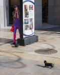
Long – Short


Both of these photographs were taken with a lens of 60mm efl and ISO 100. The first at an aperture of f13, shutter speed 1/45 second. The second at f22 and a shutter speed of 1/15 second.
I puzzled about this contrast for quite a while. I wanted to find a different way of looking at the contrast ‘long – short’ rather than thinking in terms of height or distance. Eventually I decided on a temporal theme working with the contrast of a ‘long time’ and a ‘short time’.The idea being to show two scenes: one where there was a long time to cross the road and the other where there was only a short time.
I was keen to use this sort of location because I have never been comfortable with street photography, partly because taking photographs of people has never appealed to me and because I think of it is an intrusion into their privacy. Despite those reservations I decided that one of the important aims of this course for me is to extend the boundaries of my photographic experiences so the idea of showing a contrast between a ‘long time’ and a ’short time’ within the genre of street photography ticked a few boxes at the same time.
The two photographs were taken in the same location on the same day and show people crossing a 20 meter wide dual carriageway at a pedestrian crossing in Malaga City, Spain. There were some practical difficulties. It is not the easiest task in Andalucia, or indeed a number of other places I quickly add, to find a pedestrian crossing where people feel inclined to hurry when the lights are about to change. To try and compensate for this I used a long crossing without a central reservation and where there is a timing system which shows the number of seconds remaining before the lights change. The time display is below the 30km sign, to the immediate left of the lower set of traffic lights.
In the image for ‘long’ the timer is showing 27 seconds remaining whereas in the image for ‘short’ you can just see there is one second remaining. The timings would have shown better with a more straight-on composition but I wanted to try and get a pedestrian flow across the frame to help me capture a sense of movement, so I positioned the camera to one corner of the crossing. This position created an angle slightly restricting the view of the time display. The other issue I had with the timing display related to the strength of the sunlight on it. I had tried to capture the two images at different crossings two days before but the sun was too strong so the time didn’t show clearly enough. On the day I took these images the sun was less prominent and so the range of brightness was less.
As it turned out my concentration on the time display became less relevant as just before I was about to finish for the day a brave pedestrian and his intrepid dog decided that two seconds was enough to cross the 20 metres of dual carriageway if they ran! The increased blur and the legs in a running position meant I was able to capture the energy of a rushing movement to reinforce the visual impression that he had a ‘short time’ left to cross before the traffic moved off. The time display therefore became a supporting part of the composition rather than having a more central importance in illustrating the contrast.
Even though the first image is intended to convey the pedestrians have a long time to cross, I also wanted to retain an impression of movement within the image whilst not losing the sense of a leisurely stroll across the road rather than a rush. In the ‘long time’ image the shutter speed and angle for the shot enabled me to capture blur in the movement of some of the legs with the leisurely pace of movement reinforced by the man in the foreground with the black jacket reading his papers and another pedestrian concentrating on his phone rather than being preoccupied with getting across the road before time ran out
Pointed – Blunt


Both of these photographs were taken with a 150mm efl macro lens. The first at an aperture of f16, shutter speed of 2 seconds and ISO 100. The second at f22, a shutter speed of 1/180 second and ISO 3200 because I wanted maximum depth of field, didn’t want to risk any camera shake and didn’t have a tripod available.
The first image was taken in Doncaster, England. I was attracted to the hedge in the first place because I was thinking about the combination of green leaves and red berries for the section of the course dealing with colour. The mass of prickly, pointed leaves layered behind each other with the leaves pointing in different directions made me think that it would be a good image to represent ‘pointed’. I composed the image so the leaves in the foreground extended beyond the frame to accentuate the pointed leaves as the central point rather than other parts of the hedge that were less ‘pointed’ and to crop out any red berries or distractions in the background where light was shining through the hedge. I also framed the image so the leaves were pointing in different directions to try and give a sense that whichever direction you looked in there were points.
My original idea for an image showing the contrast of ‘blunt’ was to use the same composition after cutting the points off the leaves. Although I thought this would be an interesting way of visually conveying the idea of ‘blunt’, it just didn’t seem the right thing to do so I searched around for a group of leaves that were the visually opposite to the pointed holly leaves. I decided to use part of a geranium plant which has a leaf shape with a wavy edge giving the impression that each section of a leaf has been rounded-off, hence blunted.
Liquid – Solid


Both of these photographs were taken with a lens of 60mm efl. The first at an aperture of f8, shutter speed 1/125 second and ISO 400 to give me the shutter speed and depth of field I wanted. The second at f4 to throw the background out of focus, a shutter speed of 1/180 second and ISO 100.
Both images were taken at my house in Spain. The idea being that the first image shows olive oil in its liquid state and the second image showing next year’s olive oil in a solid state on the tree waiting to be picked and pressed. The first image took me way out of my comfort zone (and demonstrates I think why I am on a photography course and not a painting/drawing course!).
To create the image I placed some sack cloth on a table outside and filled a small plate with olive oil from last year’s crop. The image looked bland and it was difficult to know what it was so I decided to ‘draw’ a representation of an olive branch in the oil using balsamic vinegar (I thought I could always eat my composition if the image didn’t work!). I couldn’t get the right strength to the image of the olive branch at first but after switching to a balsamic cream and drawing the olive branch onto a dry plate before slowly pouring the oil on top it worked sufficiently to take the photograph. I am not sure how well the image works as a demonstration of ‘liquid’, if I had lights I think I would try to get a stronger sense of translucency in the oil to try and create a stronger impression of depth in the liquid, maybe I would choose a bowl rather than a plate to get a greater depth of oil. I would also try and get the sackcloth background lined up better, I find it a little distracting that the lines within it aren’t squared off with the frame. In the end I stuck with the image though because it was the first time I have ever constructed a composition of this nature and for me the two images work well together and symbolise the annual cycle of life in the area where the olive tree is the centre of agricultural activity and so much revolves around picking and pressing the olives.
Hard – Soft


Both of these photographs were taken on a beach near Nerja in Malaga Province with a lens of 60mm efl and at ISO 100. The first at an aperture of f9.5, shutter speed 1/60 second. The second at f8 and a shutter speed of 1/250 second. The white balance was adjusted for each image to give a warmer feel to the sand and rocks. In reality the sand and rocks are greyer in colour but I found the warmer feel more appealing.
I had originally gone to the location to take some photographs of a shrine in the rocks for the part of the course dealing with’ colour’ because it has a dedication to ‘Christ of the Sea’ handwritten in a vivid Mediterranean blue. Whilst there I checked through the assignment brief which I carried around with me (organised but sad – I’m going to the beach, what shall I take with me? I know – an assignment brief!) and realised there were a couple of potential images there that I could match against ‘hard’ and ‘soft’.
The image for ‘hard’ comes from a rock cluster next to the beach and had a few areas where a thin layer of sand can be seen. I thought this would help to give some continuity with the image of the ‘soft’ sand without detracting from the hard rocks. I settled on a low viewpoint to give me a line from the bottom right across to the left and up to the top left-hand corner of the frame. The framing was chosen to show the textural detail in the rocks to add some interest through the frame.
My aim with the image of the sand was to create the visual impression of softness through the impressions made in the sand as people walked on it. At first I thought I might create a new set of footprints that were ordered, clean and led the eye in a systematic way through the frame. I decided however that it would be better practice and a little more challenging to try and simplify the existing footprints that people had made into an interesting composition rather than to ‘artificially’ create the effect. Consequently I searched around until I found the composition shown for this contrast. I wanted a number of impressions in the sand that had an indistinct shape to reinforce the idea of sinking in to the softness and the sand collapsing around your foot but I also wanted to have at least one impression that was clearly a footprint to give a stronger context for the other impressions in the sand. In a way to take some of the guesswork out of the image – I didn’t want a viewer of the image having to work hard to decide what the ‘hollows’ in the sand were, I wanted them to know they were footprints and concentrate on the idea of ‘softness’. I also wanted an area with some other interest throughout the frame so included the area with pebbles at the top of the frame with the brightest one in the very top right-hand corner, almost out of the frame and with the clearest footprint pointing towards it, which I think helps to create a sense of movement and interest within a static subject.
Straight – Curved


Both of these photographs were taken with a 150mm efl macro lens. The first at an aperture of f2.8, a shutter speed of 1/90 second and ISO 100. The second at f22, a shutter speed of 1.5 seconds and ISO 200.
The first image is part of a piece of equipment (like a cage) used by the fishing boats and was in a storage area slowly gathering rust at Caleta de Velez near Torre del Mar, Malaga Province. I chose a wide aperture for the first image because the background was unattractive an also had a horizontal alignment which detracted from the vertical lines I wanted to accentuate to fit with the composition for the ‘curved’ image. In addition I composed the shot so it had a horizontal part of the cage at the base to anchor the verticals, with the bottom left-hand corner out of focus to help draw the eye to the straight bars and help imply depth.
The second image is part of a tree trunk in Sherwood Forest, Nottinghamshire and demonstrates the multitude of graphic design elements nature provides for free. The small clump of fungi adds a detail of interest into the photograph.
Light and Dark

This final image was taken with a 150mm efl macro lens at an aperture of f32, a shutter speed of 1 second and ISO 100. It combines two contrasts ‘light’ and ‘dark’ and is part of a series of images I took a few days after receiving the course material in early September showing the water flow over a weir at Water cum Jolly and around a supporting buttress.
Although taken on a different day the location for this photograph is the same as that for the image demonstrating ‘opaque’ but the angle of view is different – straight on rather than from the side and with a lower viewpoint so there is a hint of the water flowing over the top of the weir.
There was very little colour in the original image but I converted it to black and white using Nik Color Efex Pro and boosted contrast to accentuate the difference between the dark stone of the weir and the lighter tones of the water. A slow shutter speed allowed the light within the water to be ‘painted’ around the buttress. I also retained a hint of the flow of water over the top of the weir because the sunlight shone on that area (the rest was in shade) giving another source of interest and light in the composition. Overall I am pleased with the shapes and ethereal feel to the image and think it visually demonstrates the contrast of ‘light and dark’ quite well.
SELF ASSESSMENT
I have made a number of reflective learning comments at the appropriate point in the text of the report and these should be considered within that context as part of the self assessment.
The assessment criteria listed on page 10 of the course folder are:
- demonstration of technical and visual skills
- quality of outcome
- demonstration of creativity
- context
Demonstration of technical and visual skills
This part of the assessment criteria considers materials, techniques, observational skills, visual awareness, design and compositional skills.
In capturing the images for submission I have used all my lenses, varied the nature of exposure control using both aperture and shutter priority, experimented with different metering modes and focus programmes, and taken both tripod and hand-held exposures. In short the assignment has increased my familiarity with my camera controls, lens choice and exposure control.
I have learnt to look more deeply into the range of visual opportunities for images in a location, thinking beyond generic labels such as a ‘landscape’ into the range of contrasting visual features present in the scene. I have a better understanding of how a change in lens, position and composition can also accentuate or diminish the impact of those contrasts. Some of the images submitted show strong design elements within their composition, eg the images for ‘straight – curved’, ‘transparent – opaque’ and ‘light and dark’.
Quality of outcome
This criterion concerns content, application of knowledge, presentation of work in a coherent manner, discernment, conceptualisation of thoughts and communication of ideas.
The report has been structured in a logical manner from a summary of the key points of the brief, through background theory to presentation and discussion of the 17 images. The sections dealing with the links between cognitive psychology and this assignment demonstrate an ability to conceptualise thoughts, incorporate prior knowledge into the assignment and to communicate ideas from a broader spectrum of the literature. I think the written report presents a clear statement of the process I undertook to arrive at the endpoint for the assignment. I have conceptualised the process in generic terms – exploration, simplification and production – so there is the opportunity for a systematic transfer of learning from assignment to assignment and a schema for comparing variations in requirements between the assignments.
The images submitted meet the requirements of the brief. Some I would put on the wall, others I would not. In terms of an expert evaluation of them I am not competent at this stage of the course to give that evaluation but they have been submitted because they are of a quality that I am happy to put my name to.
Demonstration of creativity
This set of assessment criteria deal with imagination, experimentation, invention and development of a personal voice.
The experience of taking photographs to a brief has helped develop my creativity since it has encouraged me to think differently about the photographic opportunities in locations and has encouraged me to pursue themes I would not have routinely pursued, creating a still life with olive oil and balsamic cream is a good example of that point. I think some of the images showing visual contrasts may be literal but this a matter of degree since all constructs (contrasts) are literal at least at a superficial level. I have tried to select compositions or locations that challenge my thinking and expose me to new experiences, such as street photography. I believe that a number of the images go beyond a literal translation, demonstrate a degree of visual creativity and are consistent with the ‘personal voice’ and style I wish to develop further. I will write a post in my Learning Log about my background thinking about a ‘personal photographic voice’ since it is a concept I am still struggling to assimilate fully into my personal set of constructs.
Context
The final criteria concerns reflection, research and critical thinking. The term ‘learning log’ is parenthesised as a final factor but I am not sure whether it should be considered to be a separate item or an explanation of where the assessor should look for proof of performance against the context criteria. Further exploration of the more detailed grid of assessment criteria suggests it means the learning log is the source of context assessment for Level 4 courses.
I have structured my electronic Learning Log to match the sections of the course to simplify access to course specific material through the menu and the category system. I am pleased with the number and content of the posts already made to the log. The biggest constraint on producing the log has been unfamiliarity with ‘blog platforms’ particularly issues of theme design constraints and image placement but I have a sufficient understanding now for this to be frustrating from time to time rather than a major constraint. I have used Windows Live Writer to help with writing and editing posts.
The post in my Learning (b)Log entitled ‘References’ is a rolling post with references added in Harvard format as they are required for entries within the log. The references applying to this report give an indication of the sources I have drawn from, in addition to the application of prior knowledge and experience from other fields.
In summary, page 8 of the course notes says this first assignment is intended to be a diagnostic piece of work to allow my “tutor to get a feel for (my) work and help him to decide how best to support (me)”. I feel my assignment report gives an accurate insight into my academic and practical approach to the course. In addition the assignment has provided a useful foundation on which I believe I can build and develop as a photographer.